Cet exercice a pour préalable d’avoir installé R et RStudio.
Se familiariser avec l’interface
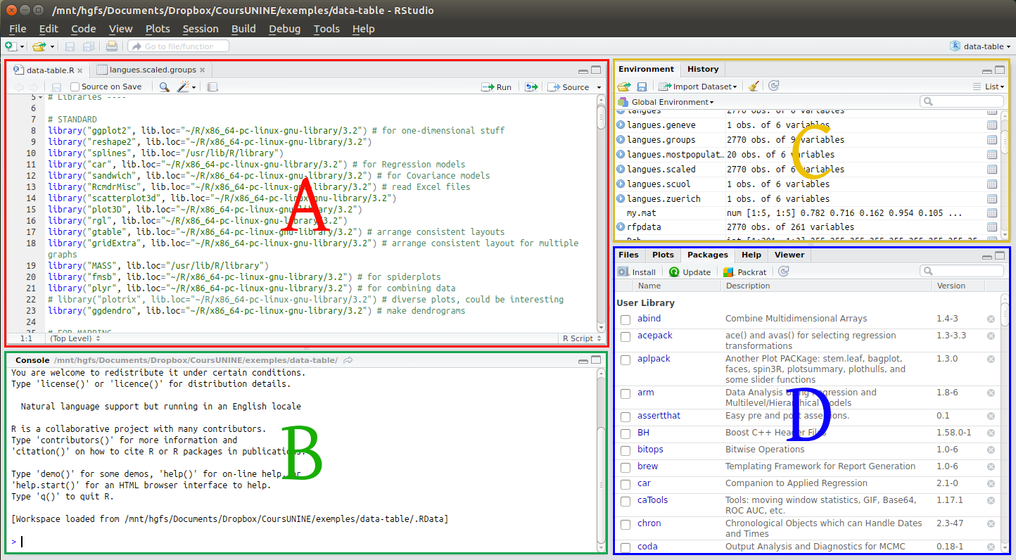
Ouvrez RStudio. Vous devriez voir l’interface comme à l’image ci-dessous, pour l’heure sans la partie A. La partie C est en principe vide:
Les fonctions de ces différentes parties sont les suivantes:
A : Fenêtre d’édition des fichiers sources. Ici vous pouvez notamment éditer votre fichier de script, sélectionner […] Continue Reading…