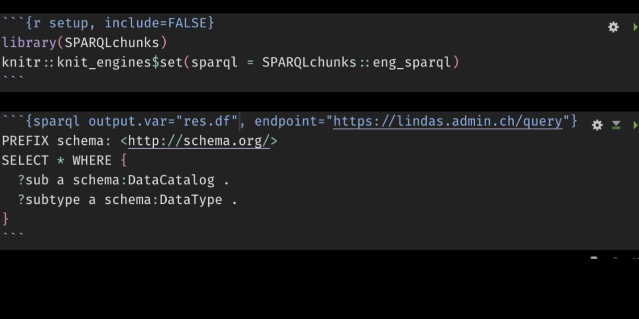
Coding in R is useless without interesting research questions; and even the best questions remain unanswered without data. RStudio provides a number of convenient ways to acces data, among which the possibility to write SQL code chunks in Rmarkdown, to run these chunks and to assign the value of the query result directly to a variable of your choice. […] Continue Reading…
Text Mining: Detect Strings: Word Lookup in a Large Corpus of Phrases Using a Large Dictionary with Julia

After achieving an optimized string detection algorithm in R for 1 milion phrases using a 200k large dictionary, I wondered if I can get better results in Julia. My first attempt at this was a catastrophe. Within 24 hours, the Julia community helped me to learn some basics of Julia code optimization and proposed a blazing fast translation of […] Continue Reading…
Dessinez votre pays imaginaire avec Affinity Designer: une introduction au dessin vectoriel
But de l’exercice: découvrir des outils de base pour la création d’une carte dans le logiciel de dessin vectoriel Affinity Designer (téléchargement sur le site). Il s’agit d’un logiciel propriétaire, mais nettement moins onéreux que la suite “Creative” d’Adobe. L’exercice parvient au même résultat que celui, sur ce site, intitulé “Dessinez votre pays imaginaire avec Illustrator“ ou “Dessinez votre […] Continue Reading…
Ressources web pour les géodonnées
Le travail de la cartographe consiste à combiner des données existantes avec de nouvelles connaissances. De nombreuses ressources sont désormais accessibles de manière dynamique – par connexion directe à la source – sous forme de points d’accès WMS, WFS, linked data etc. Une seconde partie de ce post est dédié à l’intégration de ces données dans les logiciels de […] Continue Reading…
Création et analyse de cartes mentales
Source: Pocock 1976
Les cartes mentales représentent un espace tel qu’il est perçu par les habitants plutôt que tel qu’il est présenté sur les “cartes officielles” (p. ex. les cartes que vous pouvez charger à partir de ressources cantonales ou d’OpenStreetMap). Une carte mentale ne s’inscrira souvent pas dans une vision topographique de l’espace, avec ses coordonnées, sa projection, son […] Continue Reading…
Ideograph – explore ideologies of political parties with SPAQRL requests to WikiData, D3 and PixiJS.
Ideograph is a visual tool for exploring ideologies of political parties. It queries its data directly from the frequently updated WikiData graph database. You can filter the graph by country, and find further information by clicking on the node labels.
Ideograph is licensed under GNU GPL 3.0.
ideograph
Presentation Video
I’ve presented IdeoGraph at the Wikidata for Civil Tech session. Watch the 5 […] Continue Reading…
Unify the extent of rasters in QGIS 3 to avoid clipping by raster calculator
This one drove me crazy today! If you try to sum values from rasters with different extent, the raster calcultor clips the result to their overlapping zone. This might make sense in most cases, but in many other cases it absolutely does not. Users should have a choice.
An old workaround (2013) is proposed on a page called Raster extent […] Continue Reading…
Premiers pas avec le module R “Quanteda” pour l’analyse linguistique
Cet exercice a pour but de vous familiariser avec le module Quanteda pour l’analyse linguistique. Il présuppose que vous avez fait les premiers pas avec R et Rstudio.
Installez et activez les modules
Installez les modules quanteda, quanteda.textstats, quanteda.textplots, readtext, ggplot2 et udpipe:
Créez un nouveau script R pour sauvegarder la progression de votre travail. Ajoutez les lignes suivantes à votre […] Continue Reading…
Reorder geom_bar or anything else in ggplot by the value of your choosing
You still find recent answers on StackOverflow counseling to redefine the factors of a data.frame to reorder elements of a ggplot graphic. In the 2020’s, this can be avoided. Factors are a heritage of a numerical focus of R, when text values were seen as an anomaly or, at best, as ordinal values. I highly recommend leaving the […] Continue Reading…
Scrape an image from DeepZoom with R and magick, recomposing a single image from multiple tiles
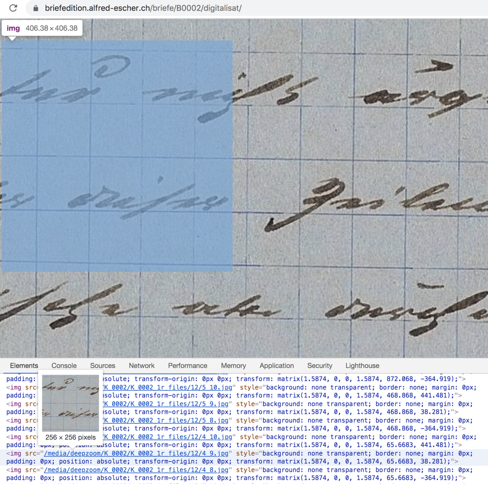
DeepZoom allows webmasters to display high resolution images in an online viewer. Among its users:
The British LibraryThe World Digital Library (WDL)Polona, the Polish Digital National LibraryBALaT, Belgian Art Links and Toolsand many others
DeepZoom mostly discourages downlading the original high resolution images to your local drive. This is how to get these images nevertheless with the help of R.
Examining […] Continue Reading…