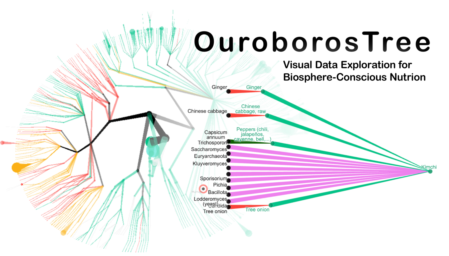
OUROBOROS TREE is a visual application for exploring relations between human nutrition and living organisms. I have built it because many contemporary issues can be addressed through a prism of our relationship with “non-humans” (according to Bruno Latour’s terminology). The project is evolving and welcomes feedback from the public. OurobosTree harmonizes, for the first time, […]
Tag Archives: d3js
Ideograph – explore ideologies of political parties with SPAQRL requests to WikiData, D3 and PixiJS.
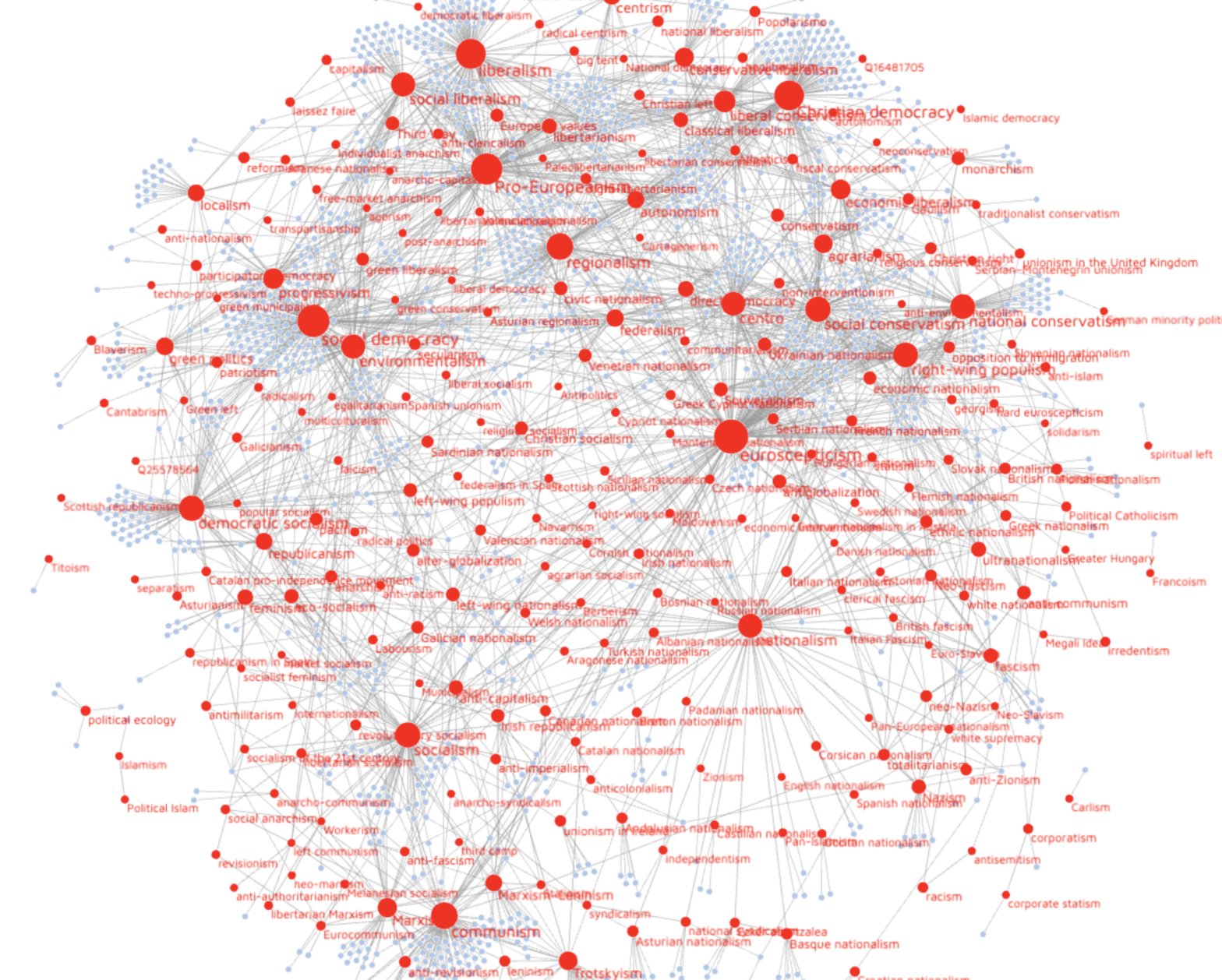
Ideograph is a visual tool for exploring ideologies of political parties. It queries its data directly from the frequently updated WikiData graph database. You can filter the graph by country, and find further information by clicking on the node labels. Ideograph is licensed under GNU GPL 3.0. Presentation Video I’ve presented IdeoGraph at the Wikidata […]
Visualisation et analyse des relations entre images dans un espace réseau, dans un espace signifiant et dans un espace topographique

Ceci est un workshop créé par l’auteur pour le laboratoire d’architecture ALICE (EPFL-ENAC) dans le cadre du projet de recherche et d’enseignement POLIPHILO. Nous allons apprendre à interroger une base de données et à projeter des images prises sur le terrain dans divers espaces paramétriques pour une analyse en termes de phénoménologie spatiale. Le workshop vise à […]
GéoRécits3D : mapping journeys and shared places in a space-time aquarium
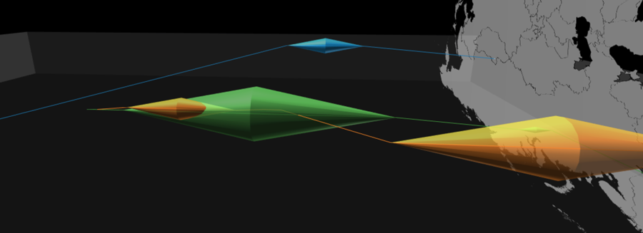
Spatial mobility always involves at least two types of distances: the topographical distance traveled on the surface of the Earth and the time distance taken to do so. GéoRécits3D allows you to map both in a “space-time aquarium” (a cuboid with one dimension dedicated to time). It is written using HTML5 and JavaScript, and uses […]
GéoRécits – an application for mapping journeys and lived spaces

GéoRécits allows you to map interviews pertaining to individuals’ mobility. You can compare individual travel journeys made by several individuals and leading to a common final destination – useful in the analysis of migrations – or analyse travel patterns accomlished for a given duration of time. The two functions of GéoRécits GéoRécits produces three types […]
Dessiner une carte à main levée avec du code – D3js et roughjs
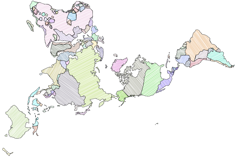
Pourquoi ces cartes hachurées à la main? Dans le cours, nous avons eu l’occasion de voir les cartes de Philippe Rekacewicz, intentionnellement coloriées à la main. En voici un exemple sur visionscarto.net. Ces cartes aux aspects de croquis ont plusieurs avantages. D’abord, elles libèrent leur lecteur de l’évidence de la carte. Contrairement aux tracés géométriques […]
Dymaxion world map with proportional circles and automatic legend in D3.js v5
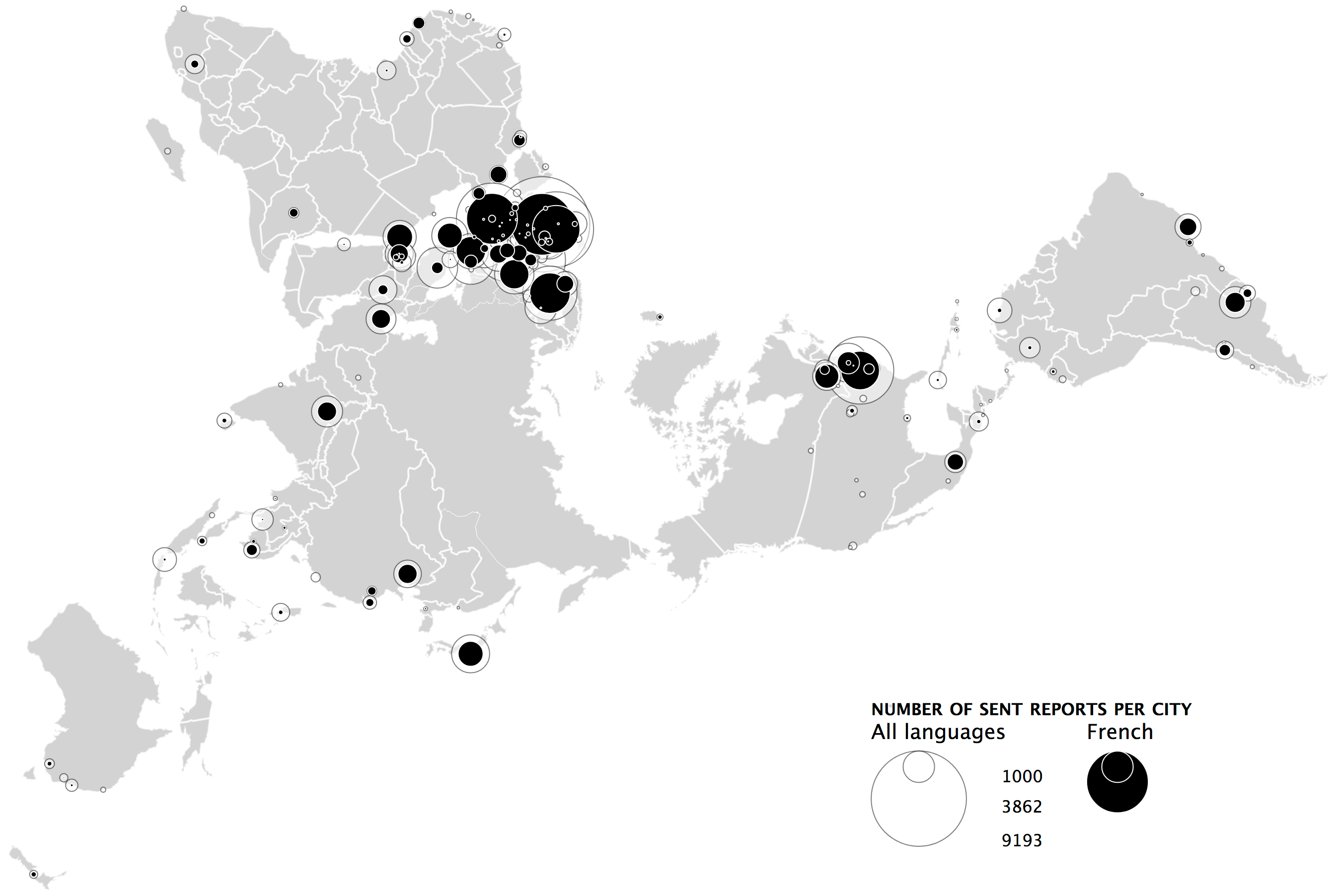
The legend for proportional circles sizes is drawn automatically. Reprojectiong on the fly from WGS84 to the newly available AirOcean (Dymaxion projection) in D3v5. Example data: number of political reports sent by Swiss embasies to Bern in all languages and in French specifically betwee 1920 annd 1960. Basemaps are from here. Running D3 version of […]