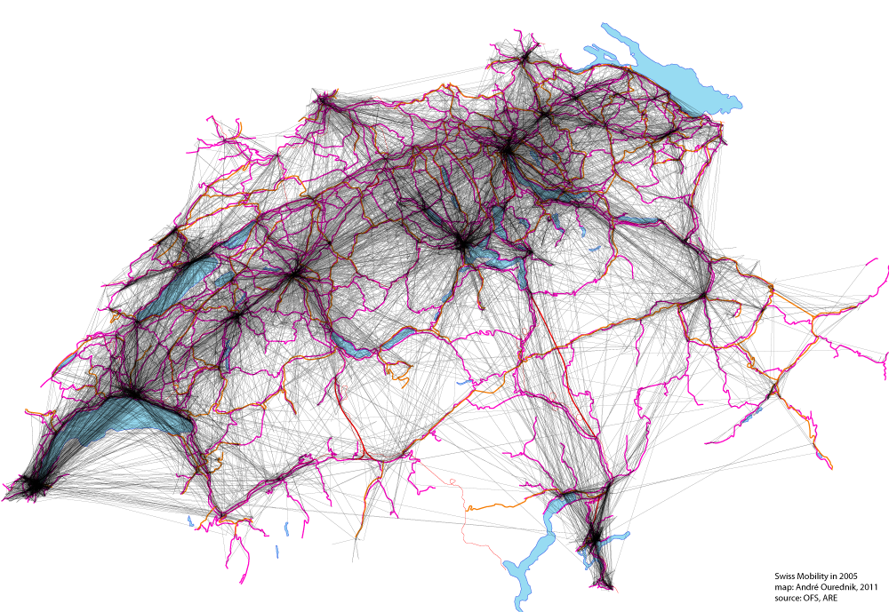
This map shows all movements made by Swiss citizens questioned on their traveling practices in the “Mikrozensus zum Verkehrsverhalten 2005“. 33’390 people have been asked. The map includes trips made for the purpose of work, study, leisure and household matters.
Material infrastructures, like roads and railways, are shown too, in pink and red, but they are not the main point here, with the respect to the question of mobility. What really moves and, by moving, makes relations between places effective, are the travelers themselves. Places are primarily linked by those who move between them.
Recorded movement between any two places is shown in black transparent lines. Transparency is essential here, as overlapping generates darker regions, revealing main mobility network nodes.
Observations
The star-shaped nodes coincide with large cities, both sources and attractors of travel. The city of Luzern appears as one of the largest – surprisingly so, because it is relatively small in terms of residential population. Luzern is an important touristic attraction, though, which explains its centrality in terms of mobility.
Note also the coincidence, between actual movements, and the density of the transportation network (railroads and roads are shown in red and pink). Where they don’t coincide might be a sign of suboptimal – or subefficient – territorial planning. One might ask, for instance, whether it was really “necessary” to build the Lötschberg Base Tunnel… Analyzing mobility data from 2010 might at least tell us whether the construction of this link had any effect on the individual mobility structure.
Tools
Mapping tools: ArcMap, Python script, Illustrator.
Trick: transparency has been applied to straight lines to accentuate main nodes and to prevent rare connections from covering the picture.


