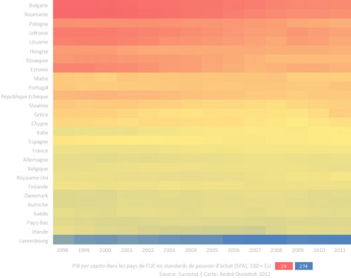
The infographic above looks like a sunset or a sunrise rendered in an impressionist painting of the pixel age. It illustrates EU’s per capita domestic product from 1998 to 2011, expressed in “purchasing power standard” (PPS). To get the PPS, you divide the per capita GDP by the purchasing power parity index. It says, more or less, how much goods an average person can afford in one’s own country. Red means the lowest, blue means the highest; yellow intermediate. By definition, the PPS is set to 100 every year, meaning 100% of the EU per capita GDP. Deep red means: the average person in that country can afford only 26% of what the average European affords. The years go from left to right.
The countries are ordered according to PPS values in 2007, i.e. the year when the US housing bubble blows.
As the average is set at 100 every year, one doesn’t see the evolution of the GDP in figure above, but the evolution of the differences between European countries. One would have a have a column of yellow only, if variance dropped to zero. But it doesn’t.
The upper left corner region is the most red, and the lower right the most blue. This means the poorest countries evolve to become more average, or that the average is becoming poor. It also means that the gap between the richest country and the EU average keeps on growing
Luxemburg’s very blue, for instance, which means that the average Luxembourger can buy three times as much as an average European does.
Bulgaria and Romania start off in the worst situation in 1998 but evolve towards the average. (Nevertheless, last year, university lecturers working full time in Romania told me they still depend on subsistence agriculture. On weekends, after the lectures, they fetch food at their parents’ farms.)
The Baltic States: Estonia, Latvia and Lithuania had some serious fallback in 2009. They steadily becomes more “yellow” and then turn red again. They’ve been hit harder than others by the Global Financial Crisis.
Unlike Malta, that seems to rebound then, after eight years of relative decline. Perhaps it just doesn’t get as bad as elsewhere.
Greece and Portugal get the blow in 2011. The UK too, actually, only there, we start of more “greenish” in 2010. There’s some buffer before falling in deep red poverty.
In the lower part of the frame, you see “yellowish-greenish” countries, like morning dew above the blue line of Luxemburg. Or the evening fog. At moments, they turn bluer, at moments, they become yellow again. As if they couldn’t condensate more wealth. As if it was evaporating as fast as it condensates. Their GDP just oscillates around the current EU average (yellow).
An infographic cartogram
In the next figure, I’ve removed the country names, and I’ve adjusted the line heights to the population sites. It’s something like a time-series cartogram. Now you see how many Europeans live in the average, how many struggle more then others, and how many get walthier or poorer over the years.
Most Europeans live in the fog of average wealth.
And a quarter of them struggles to survive.
As for Luxemburg, it’s got only half a million people and cease see it on this time-series map.

Tools: Excel (conditional formatting for the first figure and line height for the second one), Illustrator.
Data source: Eurostat data provided on the INSEE site.
