Graphics of the evolution of the COVID-19 pandemic. Updated regularly since March 31st. Source code for graphic production included.
Excellent graphics of the evolution of the COVID-19 have been made by John Burn-Murdoch for the Financial Times or by Lisa Charlotte Rost for the Grand Continent (observatoire Coronavirus : tendances globales). Not only use they a logarithmic scale, but count days since the 100th case allowing effective comparison of evolution scenarios. They also add diagonal lines to whitch the evolution slope of cases can be compared: doubling every day, every two days, every three days and every week. Since there is a linear relationship between geometric progressions and logarithms, a geometric progression like “doubling every week” appears, in effect, as a straight line on a logarithmic scale.
Le Grand Continent has also produced graphics putting in parallel the number of cases with the number of actual tests per day, allowing for a critical perspective on of the number of reported cases.
For another, very inovative representation of the COVID-19 data, see Henri Reich’s post on Minute Physics Youtube channel.
On the other hand, graphics showing the proportion (per capita) of COVID-19 cases and deaths are rare. Perhaps because the use of per capita for Coronavirus data is disputed. Nevertherless, higher per capita values represent a higher socio-economical strain for a country*. The purpose of this post is 1) to show also the evolution of these proportional values and 2) to provide a reusable R code for producing these graphics.
I will update the graphics in this post on a regular basis.
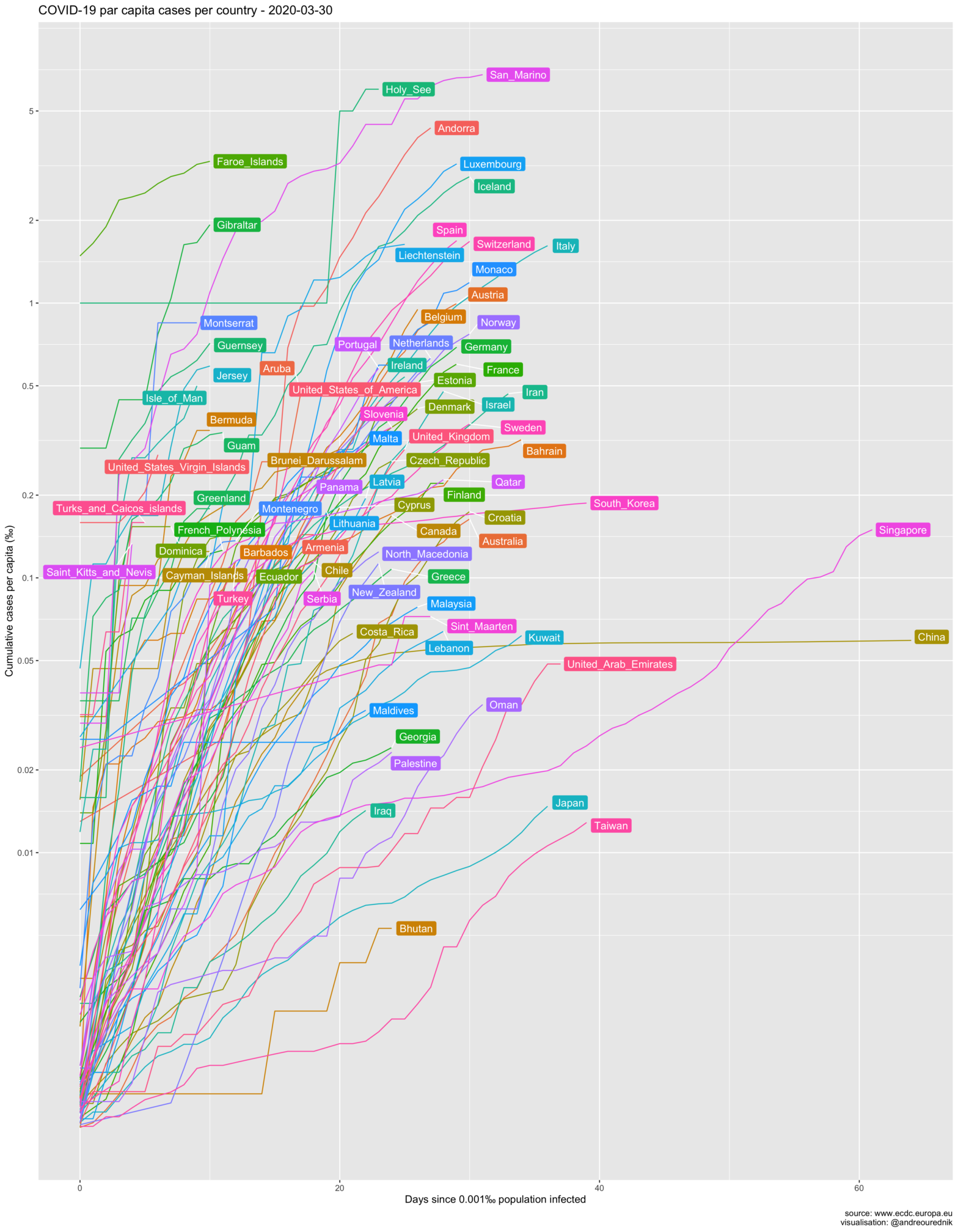
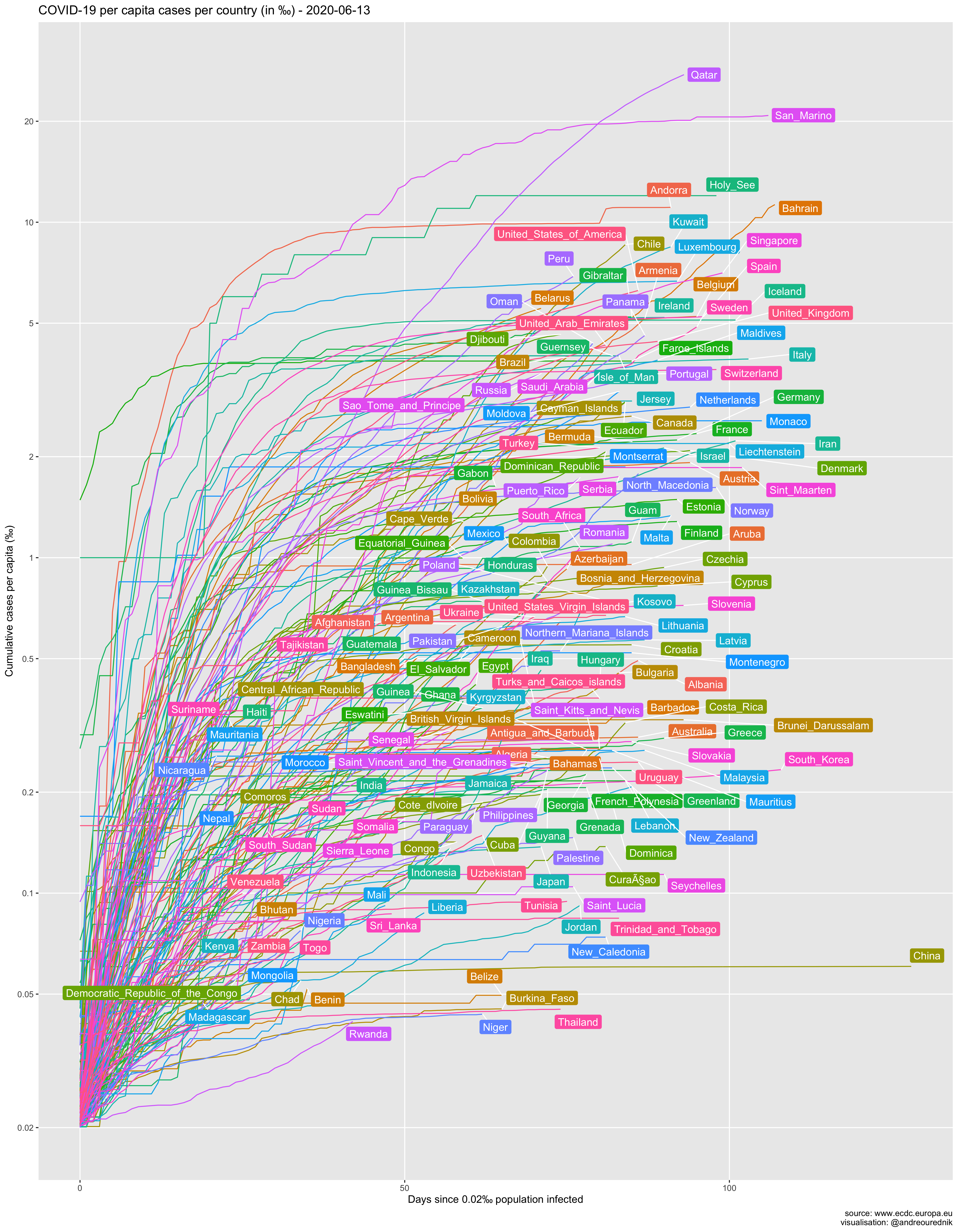
Cases per capita
So let’s see the evolution of the spread in ‰ and the number of days since 0.002‰ of a country’s population was infected. (The R source code of all graphics can be found below):
From the per-capita point of view, small countries like Luxemburg and Iceland seem on a more worrying path than others. Switzerland, with its population of under 9 million (roughly as much as the city of London), is on par with Italy and Spain in terms of population penetration of the virus. At least 1 out of 500 people have been infected. Due to the high concentration of the population in the Swiss Plateau, the probability of exposure is very high, or would be without appropriate confinement measures.
Obviously, scarcely populated countries show the highest per capita contamination. The simplest explanation for this fact is that an exponential growth will always be pushed up a level if the divident of the absolute numbers is smaller. If an infected individual arrives in a country and starts an exponential growth of cases (e.g. 1,2,4,8,…), his_her impact will be more impressive in country A with population 10, than in country B with population 20:
- A: 1/10 = 0.1 , 2/10 = 0.2 , 4/10 = 0.4 , 8/10 = 0.8
- B: 1/20 = 0.05 , 2/20 = 0.1 , 4/20 = 0.2 , 8/20 = 0.4
The 1000 inhabitants of the Holy See had their per capita infections upsurge to 1‰ with the first infected and quickly rose to 6‰…
Despite this “artificial” upwards translation, curves for all countries would remain parallel on a logarithmic scale if the infection rates were equal. Steeply rising infection slopes in Bahrain or Gibraltar, in comparison to other countries, should be taken more seriously on the capita diagram as they would on the absolute numbers one.
Another explantion could be that it is easier for smaller countries to gather coherent staitistical data; their figures might reflect reality more accurately. More interestingly, we can hypotesize that the networks of social interactions in these countries are denser, i.e. more interconnected, leading to more exposure… and psychological impact. If you are one of the 35000 inhabitants of San Marino, the chances that you know someone who died from the infection are very high.
Many countries with a small territory are also very densely populated. From this point of view, the situation of the very dense city-state of Singapore is also much more worrying than on the graphic of the total number of cases below.
The USA is currently first by the number of cases. Trump supporters tried to argue that, as a country with a large population, they have less cases per capita. As it turns out, US per capita infection rate is, too, among the highest in large developped countries. (Read more about the mitigation of the pandemic in the US here.)
Absolute numbers of cases
For comparison, here is a more familiar graphic of the total number of cases:
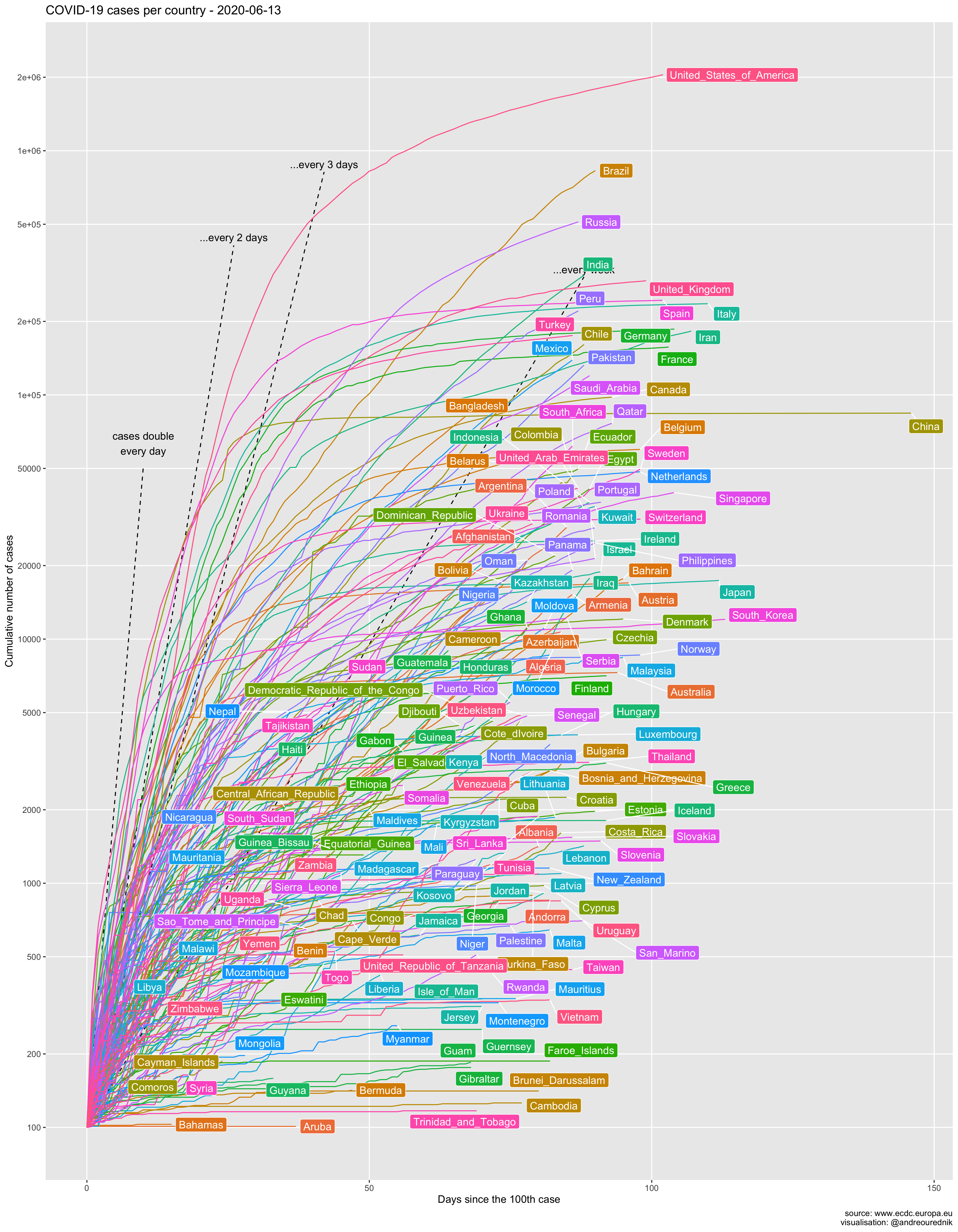
One thing to note on this graphic is the great discrepancy between the official evolution in most countries and the official evolution in China. As if the mathematical properties of exponential series did not apply in the kingdom of Xi Jinping. Even Iran, though not famous for its transparent democracy, displays more credible figures. China’s data are more comparable to, say, those of the sultanate of Brunei. At least the number of dead in Wuhan have been recounted on April 17th.
The effect of the ill-advised attitude of Bolsonaro in Brazil also shows strongly on the graphic.
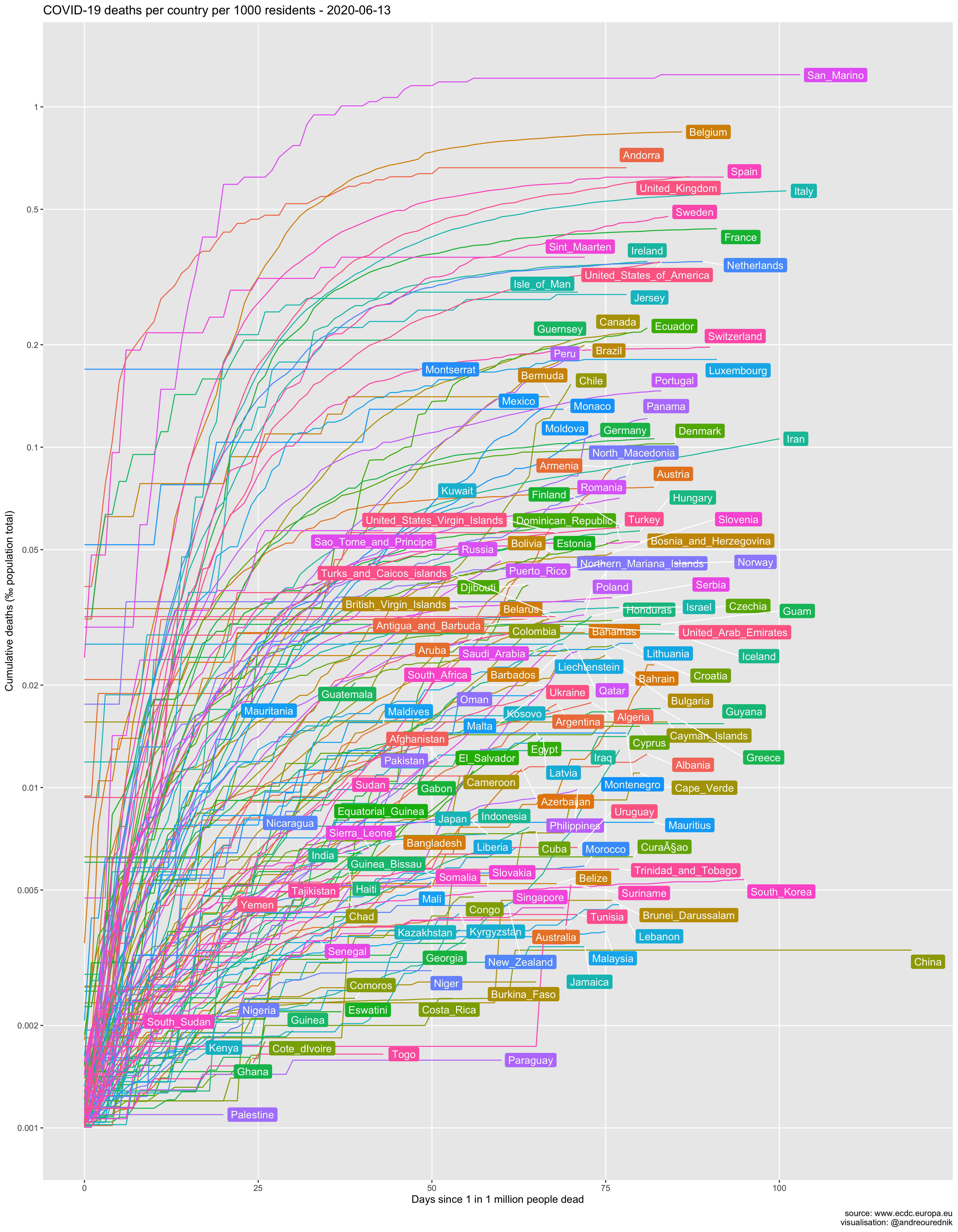
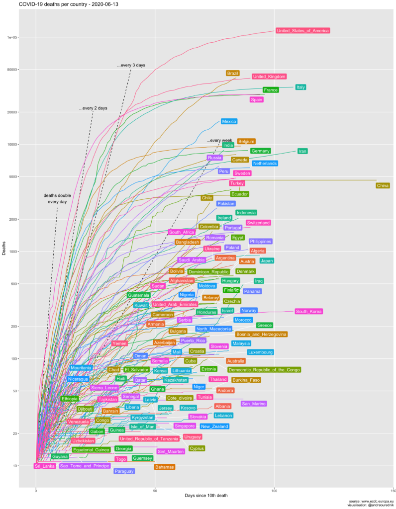
The number of deaths
“China’s official death toll from the coronavirus pandemic jumped sharply Friday as the hardest-hit city of Wuhan announced a major revision that added nearly 1,300 fatalities. The new figures resulted from an in-depth review of deaths during a response that was chaotic in the early days. They raised the official toll in Wuhan by 50% to 3,869 deaths. While China has yet to update its national totals, the revised numbers push up China’s total to 4,632 deaths from a previously reported 3,342.” KEN MORITSUGU, ABC News, 17 April 2020, 14:22.
Per capita
In absolute numbers
The figures’ source code
Since the data about COVID-19 is openly available, for instance on the EU Open Data Portal, you can easily reproduce these figures. Here is the R source code:
# COVID-19 graphs

# Load libraries ----

library(openxlsx)
library(magrittr)
library(data.table)
library(ggplot2)
library(ggrepel)

# Fetch data ----

# Source documentation : https://data.europa.eu/euodp/en/data/dataset/covid-19-coronavirus-data/resource/55e8f966-d5c8-438e-85bc-c7a5a26f4863

data <- read.xlsx("https://www.ecdc.europa.eu/sites/default/files/documents/COVID-19-geographic-disbtribution-worldwide.xlsx") %>% as.data.table()

# Transform data and correcte errors ----
data[,date:= as.Date(dateRep, origin = "1899-12-30")] # convert data from Excel
setorder(data,countriesAndTerritories,date)
data[cases<=0,cases:=0] # negative numbers should not occur
data[deaths<=0,deaths:=0]
data[, cumulcases := cumsum(cases), by=list(countriesAndTerritories)]
data[, cumuldeaths := cumsum(deaths), by=list(countriesAndTerritories)]
data[, cumulcases_per_capita := cumulcases / popData2018]
data[, cumuldeaths_per_capita := cumuldeaths / popData2018]
data <- data[countriesAndTerritories!="Cases_on_an_international_conveyance_Japan"] # remove this since passengers now evacuated.

countries <- unique(data$countriesAndTerritories)

# Functions ----

cntrdatef <- function(startcasenum,cumulwhat){
  daystart <- sapply(countries, function(x) {
    thisc <- data[countriesAndTerritories==x]
    startcase <- which(thisc[,..cumulwhat] > startcasenum) %>% min
    return (thisc[startcase,dateRep])
  })
  cntrd <- data.table(country = countries, firstcaseconsidered = daystart)
  cntrd[,firstcaseconsidered:= as.Date(firstcaseconsidered, origin = "1899-12-30")]
  setkey(cntrd,country)
  return (cntrd)
}

# Maximum date for the plot titles ----

maxdate <- max(data$date)

# Plots ----

## Cases since n_th case ----

startcasesabsolute <- 100
cntrdate <- cntrdatef(startcasesabsolute,"cumulcases")
data[,day_nth_case := cntrdate[countriesAndTerritories,firstcaseconsidered]]
dataclean <- data[!is.na(day_nth_case) & date >= day_nth_case,]
dataclean[,daysince_nth_case := date - day_nth_case ]
dataclean[daysince_nth_case==0, cumulcases := startcasesabsolute] # starting at intercept. Depending on the country, the firts number after 100 can be 200 or 101. This would make the chart less readable.
dataforlabels <- dataclean[dataclean[, .I[which.max(date)], by=countriesAndTerritories]$V1]

geomseries <- function(x) {startcasesabsolute*2^(x-1)}

d1mark <- 10
d2mark <- 24
d3mark <- 40
d7mark <- 70

yscalebreaks <- sapply(c(1,2,5), function(x) {x * 10^(0:10)}) %>% t %>% as.vector %>% .[.<max(dataclean$cumulcases)*2]

ggplot(dataclean) +
  annotate("segment", x = 0, xend = d1mark, y = startcasesabsolute, yend = geomseries(d1mark), linetype="dashed") +
  annotate("text",x=d1mark,y=geomseries(d1mark),label="cases double\nevery day",vjust=-0.5) +
  annotate("segment", x = 0, xend = d2mark, y = startcasesabsolute, yend = geomseries(d2mark/2), linetype="dashed") +
  annotate("text",x=d2mark,y=geomseries(d2mark/2)+2000,label="...every 2 days",vjust=-0.5) +
  annotate("segment", x = 0, xend = d3mark, y = startcasesabsolute, yend = geomseries(d3mark/3), linetype="dashed") +
  annotate("text",x=d3mark,y=geomseries(d3mark/3),label="...every 3 days",vjust=-0.5) +
  annotate("segment", x = 0, xend = d7mark, y = startcasesabsolute, yend = geomseries(d7mark/7), linetype="dashed") +
  annotate("text",x=d7mark,y=geomseries(d7mark/7),label="...every week",vjust=-0.5) +
  geom_line(aes(x=daysince_nth_case,y=cumulcases,color=countriesAndTerritories)) +
  scale_y_continuous(breaks = yscalebreaks, labels = prettyNum, trans="log2") +
  theme(legend.position = "none") +
  geom_label_repel(
    data=dataforlabels[cumulcases > 1000 | daysince_nth_case > 10],
    aes(x=daysince_nth_case,y=cumulcases,label = countriesAndTerritories, fill=countriesAndTerritories),
    color = "white",
    nudge_x = 1,
    na.rm = TRUE
  ) +
  labs(
    title = paste("COVID-19 cases per country -", maxdate),
    y = "Cumulative number of cases",
    x = paste0("Days since the ",startcasesabsolute,"th case"),
    caption = "source: www.ecdc.europa.eu\nvisualisation: @andreourednik"
  ) +
  theme(panel.grid.minor = element_blank())
ggsave(paste0("covid_19_cases_since_",startcasesabsolute,"th_case_",maxdate,".png"),width=14,height=18)

## Cases since n per capita ----

startcasespercapita <- 0.00002
cntrdate <- cntrdatef(startcasespercapita,"cumulcases_per_capita")
data[,day_n_cases_pc := cntrdate[countriesAndTerritories,firstcaseconsidered]]
dataclean2 <- data[!is.na(day_n_cases_pc) & date >= day_n_cases_pc,]
dataclean2[,daysince_n_cases_pc := date - day_n_cases_pc ]
# dataclean2[daysince_n_cases_pc==0, cumulcases_per_capita := startcasespercapita] # leave the starting point at day 0 transposed, because the 1st case has a totally differnt impact in terms of per capita
dataforlabels2 <- dataclean2[dataclean2[, .I[which.max(date)], by=countriesAndTerritories]$V1]

dataselection <- dataforlabels2[cumulcases_per_capita > 0.0001 | daysince_n_cases_pc > 15]

yscalebreaks <- sapply(c(1,2,5), function(x) {x * 10^(-2:10)}) %>% t %>% as.vector %>% .[.<max(dataclean2$cumulcases_per_capita)*2000]

ggplot() +
  geom_line(
    data=dataclean2[countriesAndTerritories %chin% dataselection$countriesAndTerritories ],
    aes(
      x=daysince_n_cases_pc,
      y=cumulcases_per_capita*1000,
      color=countriesAndTerritories
    )
  ) +
  scale_y_continuous(
    breaks = yscalebreaks,
    labels = prettyNum,
    trans="log2"
  ) +
  theme(legend.position = "none") +
  geom_label_repel(data=dataselection,
    aes(
      x=daysince_n_cases_pc,
      y=cumulcases_per_capita*1000,
      label = countriesAndTerritories,
      fill=countriesAndTerritories
    ),
    label.size=0.001,
    color = "white",
    nudge_x = 1,
    na.rm = TRUE
  ) +
  labs(
    title = paste("COVID-19 par capita cases per country -", maxdate),
    y = "Cumulative cases per capita (‰)",
    x = paste0("Days since ",startcasespercapita*1000,"‰ population infected"),
    caption = "source: www.ecdc.europa.eu\nvisualisation: @andreourednik"
  ) +
  theme(panel.grid.minor = element_blank())
ggsave(paste0("covid_19_cases_per_capita_since_",startcasespercapita*1000,"promille_infected_",maxdate,".png"),width=14,height=18)

## Deaths since n_th death ----

startdeathsabsolute <- 10
cntrdate <- cntrdatef(startdeathsabsolute,"cumuldeaths")
data[,day_nth_dead := cntrdate[countriesAndTerritories,firstcaseconsidered]]
dataclean3 <- data[!is.na(day_nth_dead) & date >= day_nth_dead,]
dataclean3[,daysince_nth_dead := date - day_nth_dead ]
dataclean3[daysince_nth_dead ==0, cumuldeaths := startdeathsabsolute]
dataforlabels3<- dataclean3[dataclean3[, .I[which.max(date)], by=countriesAndTerritories]$V1]

dataselection <- dataforlabels3[cumuldeaths > 70 | daysince_nth_dead > 10]

geomseries <- function(x) {startdeathsabsolute*2^(x-1)}

d1mark <- 8
d2mark <- 22
d3mark <- 37
d7mark <- 70

yscalebreaks <- sapply(c(1,2,5), function(x) {x * 10^(0:10)}) %>% t %>% as.vector %>% .[.<max(dataclean3$cumuldeaths)*2]

ggplot() +
  annotate("segment", x = 0, xend = d1mark, y = startdeathsabsolute, yend = geomseries(d1mark), linetype="dashed") +
  annotate("text",x=d1mark,y=geomseries(d1mark),label="deaths double\nevery day",vjust=-0.5) +
  annotate("segment", x = 0, xend = d2mark, y = startdeathsabsolute, yend = geomseries(d2mark/2), linetype="dashed") +
  annotate("text",x=d2mark,y=geomseries(d2mark/2),label="...every 2 days",vjust=-0.5) +
  annotate("segment", x = 0, xend = d3mark, y = startdeathsabsolute, yend = geomseries(d3mark/3), linetype="dashed") +
  annotate("text",x=d3mark,y=geomseries(d3mark/3),label="...every 3 days",vjust=-0.5) +
  annotate("segment", x = 0, xend = d7mark, y = startdeathsabsolute, yend = geomseries(d7mark/7), linetype="dashed") +
  annotate("text",x=d7mark,y=geomseries(d7mark/7),label="...every week",vjust=-0.5) +
  geom_line(
    data=dataclean3[countriesAndTerritories %chin% dataselection$countriesAndTerritories ],
    aes(
      x=daysince_nth_dead,
      y=cumuldeaths,
      color=countriesAndTerritories
    )
  ) +
  scale_y_continuous(
    breaks = yscalebreaks,
    labels = prettyNum,
    trans="log2"
  ) +
  theme(legend.position = "none") +
  geom_label_repel(data=dataselection,
    aes(
      x=daysince_nth_dead,
      y=cumuldeaths,
      label = countriesAndTerritories,
      fill=countriesAndTerritories
    ),
    label.size=0.001,
    color = "white",
    nudge_x = 1,
    na.rm = TRUE
  ) +
  labs(
    title = paste("COVID-19 deaths per country -", maxdate),
    y = "Deaths",
    x = paste0("Days since ",startdeathsabsolute,"th death"),
    caption = "source: www.ecdc.europa.eu\nvisualisation: @andreourednik"
  ) +
  theme(
    panel.grid.minor = element_blank()
  )
ggsave(paste0("covid_19_deaths_since_",startdeathsabsolute,"th_death_",maxdate,".png"),width=14,height=18)


# Deaths since n deaths per capita ----

startdeathspercapita <- 0.000001
cntrdate <- cntrdatef(startdeathspercapita,"cumuldeaths_per_capita")
data[,day_n_deaths_pc := cntrdate[countriesAndTerritories,firstcaseconsidered]]
dataclean4 <- data[!is.na(day_n_deaths_pc) & date >= day_n_deaths_pc,]
dataclean4[,daysince_n_deaths_pc := date - day_n_deaths_pc ]
dataforlabels4<- dataclean4[dataclean4[, .I[which.max(date)], by=countriesAndTerritories]$V1]

dataselection <- dataforlabels4[cumuldeaths_per_capita > 0.000002 | daysince_n_deaths_pc > 10]

yscalebreaks <- sapply(c(1,2,5), function(x) {x * 10^(-4:10)}) %>% t %>% as.vector %>% .[.<max(dataclean4$cumuldeaths_per_capita)*200000]

ggplot() +
  geom_line(
    data=dataclean4[countriesAndTerritories %chin% dataselection$countriesAndTerritories ],
    aes(
      x=daysince_n_deaths_pc,
      y=cumuldeaths_per_capita*100000,
      color=countriesAndTerritories
    )
  ) +
  scale_y_continuous(
    breaks = yscalebreaks,
    labels = prettyNum,
    trans="log2"
  ) +
  theme(legend.position = "none") +
  geom_label_repel(data=dataselection,
    aes(
      x=daysince_n_deaths_pc,
      y=cumuldeaths_per_capita*100000,
      label = countriesAndTerritories,
      fill=countriesAndTerritories
    ),
    label.size=0.001,
    color = "white",
    nudge_x = 1,
    na.rm = TRUE
  ) +
  labs(
    title = paste("COVID-19 deaths per country per 100'000 inhabitants -", maxdate),
    y = "Cumulative deaths per 100'000 inhabitants",
    x = paste0("Days since ",startdeathspercapita*100000," deaths per 100'000 inhabitants"),
    caption = "source: www.ecdc.europa.eu\nvisualisation: @andreourednik"
  ) +
  theme(
    panel.grid.minor = element_blank()
  )
ggsave(paste0("covid_19_deaths_per_capita_since_",startdeathspercapita,"_pc_deaths_",maxdate,".png"),width=14,height=18)
Code language: PHP (php)
Notes
* Arguably, contagion probability is also higher in a population with higher per capita infected, thogh under disputable hypotheses: 1: every individual in every population meets the same number of people per day; 2: social interaction nework is denser inland than cross-border; 3: contagions is distributed evenly across all social networks.
** “In its tally, China’s National Health Commission does not include people who test positive for the virus but have no symptoms, and local authorities are reportedly suppressing information on new infections to meet the target of zero local cases.” Normile Dennis, Can China return to normalcy while keeping the coronavirus in check?, Science, Mar. 29, 2020


honestly, the validity of the numbers from nations such as china and iran, in particular, as well as most other dictatorial regimes, is so dubious they need to just be omitted from any data analysis. once we’ve eliminated the nations that we know are outright lying, we would then need to make some reasonable allowance for the remaining nations who, while not outright falsifying their numbers, have their totals significantly suppressed due to sparse and inadequate population testing. this is an excellent job of presenting the per-capita data in a meaningful format, but as the saying goes “garbage-in garbage-out” – if the raw data is mostly wildly inaccurate, one can’t really draw any conclusions no mater how well analyzed and presented.