
Most of the graphics documenation in R is dedicated to high level plotting packages that sometimes remind me of LaTeX: you spend less time producing graphical elements you need than getting rid of elements you have not asked for. Some of these packages are great, of course, and you should definitely use them for well established types of figures. For scatterplots, histograms, boxplots, violin plots, contours, density plots, you name it… my favourite is ggplot2 that can further be extended with ggforce (providing Bezier curves, Voronoi diagrams, etc.). Good results can also be obtained with lattice. For network and hierarchical trees visualisation, you have igraph, ggraph, or ape. There is even a great package named circlize for circular representations.
But data visualisation is not always about mapping variables to well established graphic systems. And though Leland Wilkinson’s Grammar of Graphics – that inspired Hadley Wickham’s ggplot2 – is certainly as important to consider as Jacques Bertin’s Sémiologie graphique, there are times when you cannot go by the book.
These are times when documentation totally fails you. Even Paul Murell’s comprehensive R Graphics starts off by presenting lattice and ggplot before speaking about the framework on top of which they are built and that really allows you to draw anything: Murell’s grid package. Step by step tutorials on using this package are difficult to find online and even its documentation is hard to follow on either CRAN or Murell’s book.
Thus, up to now, my workflow with R was either to use one of the high level packages and try to twist them to my needs, or pretreat my data with R, export it, and use Mike Bostok’s wonderful d3 framework for mapping data to visual variables in the exact way I want with javascript and SVG. This can be time-consuming, though, and needed to change. Thus, here, a hopefully easy tutorial for drawing anything you want directly in R. Before all, let us load the grid package:
library(grid)
The grid coordinate system(s)
The difficulty with grid is that it uses both relative and absolute coordinate systems, like in CSS.
- Relative coordinates are used by default. They are named npc: Normalised Parent Coordinates. The origin of an npc viewport is (0, 0) and the viewport has a width and height of 1 unit. For example, (0.5, 0.5) is the centre of the viewport.
- Absolute coordinates can be set in cm, mm, pixels and others units.
Let’s test this by drawing a square with the grid.rect() function. Note that the x and y coordinates define, by default, the center of the object. For them to define the position of the left bottom corner – more useful at most times – you would need to specify an extra parameter: just = c("left","bottom").
grid.newpage() # calling this provides you with a new clean page
grid.rect(
  x = 0.3,
  y = 0.3,
  width = 0.3,
  height = 0.3
)
Note that any coordinate or dimension values greater than 1 would draw outside of the ncp system, in other words, they would not be drawn. Anyway, in a square viewport, this gives you a square:

If you extend the viewport, you get a rectangle:
This is a nice feature to have your plots automatically adjust to the size of the viewport, but unwanted if you want to have full control of the location of objects in the perspective of producing, say, an SVG output for print. To use absolute coordinates in grid, you have to specify an unit for each measure:
grid.newpage()
grid.rect(
  x = unit(3,"cm"),
  y = unit(3,"cm"),
  width = unit(3,"cm"),
  height = unit(3,"cm")
)Code language: JavaScript (javascript)
By chance, there is a way to set the units for the whole object with the default.units parameter. Note also that you do not need to set x, y, width and height by explicitely naming the parameters, just provide them in the right order:
grid.newpage()
grid.rect(
   3,
   3,
   3,
   3,
   default.units = "cm"
)Code language: JavaScript (javascript)
Much shorter, much better.
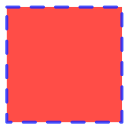
Visual propreties of objects
The visual properties of objects – like stroke color, fill color or opacity – can be set with the gp parameter, to which values are provided in the form of a list that can be created with the gpar() function:
grid.newpage()
grid.rect(
   3,
   3,
   3,
   3,
   default.units = "cm",
   gp=gpar(
     col="blue",
     fill="red",
     lty="dashed",
     lwd=3,
     alpha=0.8
   )
)
Create several objects in a loop
The most important feature of computer driven data visualisation is being able to create multiple objects by looping through variables of a data table. Let us define a simple vector, consisting of a list of color names. The RColorBrewer package – usefull for all color scheme designs – will help us.
library(RColorBrewer)
mycolors <- brewer.pal(10, "RdBu") # This gives c("#67001F", "#B2182B","#D6604D","#F4A582","#FDDBC7","#D1E5F0","#92C5DE","#4393C3" "#2166AC","#053061")
Now we create a rectangle for each color of mycolors. The y positions evolve along with 1.25*e, with e being a simple sequence of values between 1 and 10.
grid.newpage()
for(e in 1:length(mycolors)) {
   grid.rect(
     2,
     e*1.25,
     1.5,
     1,
     default.units = "cm",
     gp=gpar(
       fill=mycolors[e],
       lwd=0
     )
   )
}Code language: JavaScript (javascript)
The great thing about grid is that you can keep on drawing in the same viewport as long as you do not call grid.newpage(). So let’s add some text at each iteration of the loop with the grid.text()function:
grid.newpage()
for(e in 1:length(mycolors)) {
  grid.rect(
    2,
    e*1.25,
    1.5,
    1,
    default.units = "cm",
    gp=gpar(
      fill=mycolors[e],
      lwd=0
    )
  )
  grid.text(
    label = mycolors[e],
    x = 4,
    y = e*1.25,
    default.units = "cm"
  )
}Code language: JavaScript (javascript)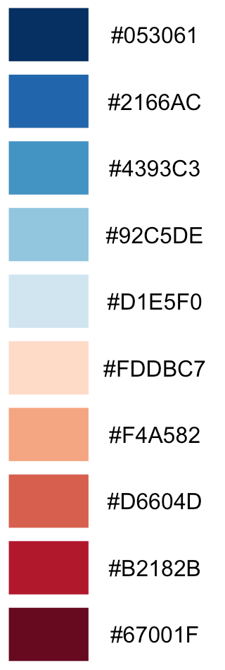
Now, let us make circles instead of rectangles, using grid.circle():
grid.newpage()
for(e in 1:length(mycolors)) {
  grid.circle(
    x = 2,
    y = e*1.25,
    r = 0.5,
    default.units = "cm",
    gp=gpar(
      fill=mycolors[e],
      lwd=0
    )
  )
  grid.text(
    label = mycolors[e],
    x = 4,
    y = e*1.25,
    default.units = "cm"
  )
}Code language: JavaScript (javascript)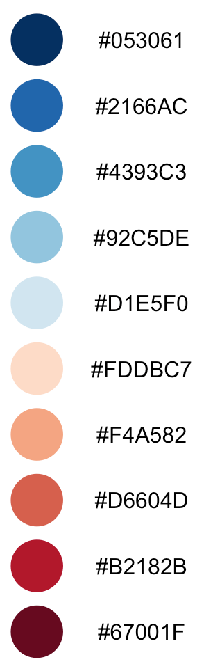
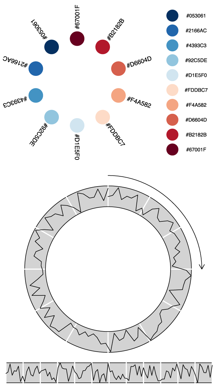
Arranging objects in a circular layout
Let us make the graphic more interesting by arranging the objects in a circular layout. This implies some high-school level trigonometry, since we want to transform lienary evolving, euclidian (x,y) coordinates to polar coordinates, in other words to positions along the perimeter of a circle. Refreshing trigonometric memory is the price to pay for more freedom in data visualisation.
grid.newpage()
step <- ((pi * 2) / length(mycolors))
current <- 0
for(e in 1:length(mycolors)) {
  cx <- sin(current) * 3 + 7
  cy <- cos(current) * 3 + 7
  grid.circle(
    x = cx,
    y = cy,
    r = 0.5,
    default.units = "cm",
    gp=gpar(
      fill=mycolors[e],
      lwd=0
    )
  )
  tx <- sin(current) * 4.5 + 7
  ty <- cos(current) * 4.5 + 7
  grid.text(
    label = mycolors[e],
    x = tx,
    y = ty,
    rot = 36 - 360/length(mycolors)*e + 90,
    default.units = "cm"
  )
  current <- current + step
}Code language: JavaScript (javascript)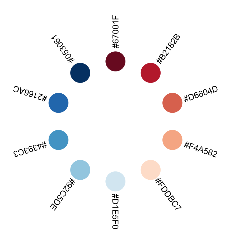
Line plots in xy
Let’s draw line plots. Of course, these can easily be produced with ggplot, but the following example with basic grid is for the sake of demonstration. First, some random data:
xcors <- seq(1:100)
ycors <- runif(1:100)Code language: CSS (css)
Line plots can be produced with the grid.lines()function. Note that x and y parameters, here, must take values in the form of vectors of a minimal length of two. In effect, a line is composed of at least two pairs of coordinates: (x1, y2), and (x2,y2). In grid.line paramaters, this is expressed as x = c(x1,x2) and y = c(y1,y2). Consistently with the logic of R, where you mostly work with table columns, coordinates on the x-axis are expressed as one vector, the coordinates on the y-axis as a second one. There is no limit to the length of any of theses vectors. I.e. you can have x = c(x1,x2,x3,xn) or y = c(y1,y2,y3,yn).
Adding more coordinates to the x or y parameters in grid.lines() will make a single “line”, not in the geometrical sense of a straigt line, but in the sense of a vector graphics “line object”, that may not be straight, i.e. composed of more than two points. For an example, this is how you produce a line with coordinates of first point (1,1), second point (2,3) and third point (5,4):
grid.newpage()
grid.lines(
  x = c(1,2,5),
  y = c(1,3,4),
  default.units = "cm"
)Code language: JavaScript (javascript)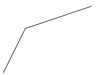
Let us now map our earlier defined xcors and ycors to a line graph. Along the way, we downscale xcors values by a factor of 10, since these evolve between 1 and 100 and our units are cm; we don’t want a meter-wide graphic:
grid.newpage()
grid.lines(
  x = xcors / 10,
  y = ycors,
  default.units = "cm"
)Code language: JavaScript (javascript)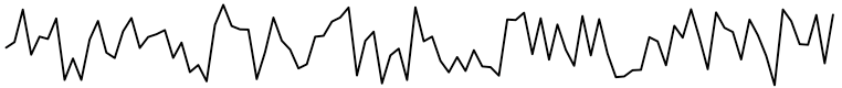
Now let us add some decoration to the line. Always remember that you can keep adding elements to the viewport as long as you don’t call grid.newpage(). In case of superpostion, newer elements overlap the older ones:
grid.newpage()
# Define translations to have your plot on a specific place on the viewport
transx <- 2
transy <- 1.5
# Add a background rectangle
grid.rect(
  min(xcors) / 10 + transx,
  min(ycors) + transy,
  (max(xcors) - min(xcors)) / 10 ,
  max(ycors) - min(ycors) ,
  default.units = "cm",
  just = c("left", "bottom"),
  gp=gpar(
    fill="lightgrey"
  )
)
# Visually subdivide the width in 12 equal parts
parts <- 12
for (i in 0:parts) {
  grid.lines(
    x = c(
        min(xcors) + ((max(xcors) - min(xcors)) / parts) * i ,
        min(xcors) + ((max(xcors) - min(xcors)) / parts) * i
      ) / 10 + transx,
    y = c( min(ycors) , max(ycors) ) + transy,
    default.units = "cm",
    gp=gpar(
      col="white",
      lwd=2
    )
  )
}
# Draw the actual line graph
grid.lines(
  x = xcors / 10 + transx, # reduce the x-amplitude
  y = ycors + transy, # translate y to 5
  default.units = "cm"
)Code language: PHP (php)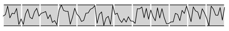
Line plots along the perimeter of a circle
Like with the circles earlier, we can let the line evolve along a circular path instead of a straigt horizontal path by using some trigonometric transformations. Note that this could also be achieved with the polar_coordinates transformation in ggplot but grid offers more explicit control at the expense of a more explicit code :
grid.newpage()
# Transform the xcors into subdivisions of the circumference of a unary circle (2π)
xcirccors <- (xcors-min(xcors)) * ((pi * 2) / (max(xcors)-min(xcors)) ) # subtracting min(xcor) because our minimum coordinate is 1 but we want to start the graphic at 0, i.e at 12 o'clock. Also subtracting min(xcor) from max(xcor), because we subdivide the circle in 99 x-parts, not in 100.
yamp <- 3 # y amplitude controller
trans <- 7 # translation
grid.lines(
  x = sin(xcirccors) * (ycors + yamp) + trans , # reduce the x-width of the curve
  y = cos(xcirccors) * (ycors + yamp) + trans , # translate y to 7
  default.units = "cm"
)Code language: PHP (php)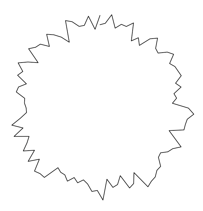
Now, again, let us add some decoration to make the figure easier to read. In the middle of the following code, you’ll notice that I define a function called rotate(). This is just an implementation of the known rotation in the cartesian plane. The last element of my code, invoking grid.bezier(), creates a simple Bézier curve; I’ve added an arrow tip with the arrow parameter.
grid.newpage()
xcirccors <- (xcors-min(xcors)) * ((pi * 2) / (max(xcors)-min(xcors)) ) # subtracting min(xcor) because we want the circle to start at 12h. Also subtracting from max(xcor), because subdividing the circle in 99 x-parts, not in 100.
yamp <- 3 # y amplitude controler
trans <- 7 # translation
grid.circle(
  x = trans,
  y = trans,
  r = yamp + 1,
  default.units = "cm",
  gp=gpar(
    fill="lightgrey"
  )
)
# Add a subdividing visual grid
lx <- c(0,0)
ly <- c(1,0)
rotate <- function(x,y,angle) { # This is just an implementation of the known rotation in the cartesian plane.
  rotmatrix <- matrix(c(
    cos(angle),-sin(angle),
    sin(angle),cos(angle)
  ),nrow=2,ncol=2)
  c(x,y) %*% rotmatrix
}
parts <- 12
for (i in 0:parts) { # subdivide the circle in 12 partitions
  rotxy <- list(
    xy1 = rotate(lx[1],ly[1], (pi/parts) * 2 * i),
    xy2 = rotate(lx[2],ly[2], (pi/parts) * 2 * i)
  )
  grid.lines(
    x <- c(rotxy[["xy1"]][1],rotxy[["xy2"]][1]) * (yamp+1) + trans,
    y <- c(rotxy[["xy1"]][2],rotxy[["xy2"]][2]) * (yamp+1) + trans,
    default.units = "cm",
    gp=gpar(
      col="white",
      lwd=2
    )
  )
}
grid.circle(
  x = trans,
  y = trans,
  r = yamp,
  default.units = "cm",
  gp=gpar(
    fill="white",
    col="black",
    lwd=1
  )
)
grid.lines(
  x = sin(xcirccors) * (ycors + yamp) + trans , # reduce the x-width of the curve
  y = cos(xcirccors) * (ycors + yamp) + trans , # translate y to 5
  default.units = "cm"
)
grid.bezier( # c(x1, x1-handle, x2-handle, x2)
  x = trans + c(0, 0.552284*(yamp+1.5) , yamp+1.5, yamp+1.5),
  y = trans + c(yamp+1.5 , yamp+1.5 , 0.55284*(yamp+1.5) , 0),
  arrow = arrow(angle = 30,
        length = unit(0.25,"cm"),
        ends = "last",
        type = "open"
  ),
  default.units = "cm"
)Code language: PHP (php)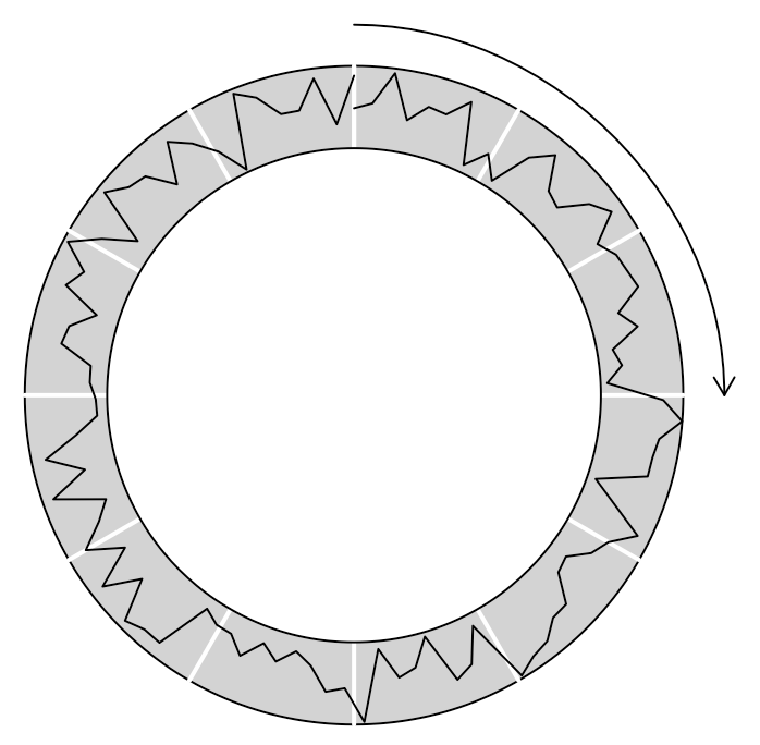
As you’ll soon discover, the possibilities are unlimited as long as you are willing to reflect by yourself how to map the variables in your data to the euclidian space and to visual variables like colour or opacity. For standard graphics, I advise the use of standard plotting packages. For going beyond standard, turn to the grid.
Export your graphics
Once you are done drawing, you can export your graphics to SVG using the gridSVG library, and do whatever you want with them: for instance edit them in Inkscape or in Illustrator or publish them as is on the web. All modern browsers read SVG.
library(gridSVG)
grid.export("/Users/ourednik/legendTest.svg",strict=TRUE)Code language: PHP (php)
Great tutorial on grid package, which now looks like the magic tikz in LaTeX for me!