
Radar charts, also called spider charts, serve to compare profiles of individuals. They are most useful if every profile is compared to an average profile. They are most pertinent when the order of the axis has an inherent sense, such as cardinal directions, the surroundings of an individual (the level of noise from left, right, front, aft), antagonistic political agendas (welfare state vs. individual responsibility, progressive vs. tradiotionalist). In a most generic approach, this is the result we want:
Let us first define the following fictional dataset:
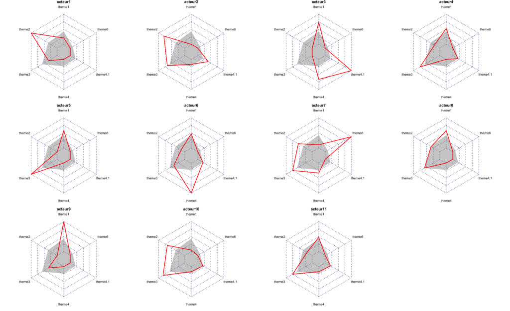
| acteur | theme1 | theme2 | theme3 | theme4 | theme5 | theme6 |
| acteur1 | 6 | 15 | 9 | 0 | 0 | 0 |
| acteur2 | 2 | 12 | 13 | 1 | 2 | 0 |
| acteur3 | 16 | 0 | 5 | 4 | 5 | 0 |
| acteur4 | 12 | 3 | 14 | 0 | 1 | 0 |
| acteur5 | 13 | 0 | 17 | 0 | 0 | 0 |
| acteur6 | 11 | 2 | 10 | 6 | 1 | 0 |
| acteur7 | 4 | 8 | 14 | 2 | 0 | 2 |
| acteur8 | 13 | 5 | 12 | 0 | 0 | 0 |
| acteur9 | 21 | 0 | 9 | 0 | 0 | 0 |
| acteur10 | 3 | 10 | 15 | 1 | 1 | 0 |
| acteur11 | 11 | 3 | 14 | 1 | 1 | 0 |
# Read the data ----
# To make the example portable, the CSV file is integrated in the form of a string, here.
data <- read.csv(text="acteur,theme1,theme2,theme3,theme4,theme5,theme6
acteur1,6,15,9,,,
acteur2,2,12,13,1,2,
acteur3,16,,5,4,5,
acteur4,12,3,14,,1,
acteur5,13,,17,,,
acteur6,11,2,10,6,1,
acteur7,4,8,14,2,,2
acteur8,13,5,12,,,
acteur9,21,,9,,,
acteur10,3,10,15,1,1,
acteur11,11,3,14,1,1,",stringsAsFactors=FALSE)
data[is.na(data)] <- 0Code language: PHP (php)
Using the fmsb library
Radar charts can be built in R using Minato Nakazawa’s fmsb library. This approach requires you to set the maxima and minima for each column of the data.frame used as a data source. This is the code to produce it:
library("fmsb")

# Put the line labels in rownames
rownames(data)<-data$acteur
data$acteur <- NULL

# Fetch minima and maxima of every column of the data-set ----
colMax <- function (x) { apply(x, MARGIN=c(2), max) }
colMin <- function (x) { apply(x, MARGIN=c(2), min) }
maxmin <- data.frame(max=colMax(data),min=colMin(data))

# Calculate the average profile ----
average <- data.frame(rbind(maxmin$max,maxmin$min,t(colMeans(data))))
colnames(average) <- colnames(data)
radarchart(average)

# Produce multiple plots ----
opar <- par() # save standard page layout settings for later restoration
# Define settings for plotting in a 3x4 grid, with appropriate margins:
par(mar=rep(0.8,4))
par(mfrow=c(3,4))
# Iterate through the data, producing a radar-chart for each line
for (i in 1:nrow(data)) {
  toplot <- rbind(
    maxmin$max,
    maxmin$min,
    average[3,],
    data[i,]
  )
  radarchart(
    toplot,
    pfcol = c("#99999980",NA),
    pcol= c(NA,2),
    pty = 32,
    plty = 1,
    plwd = 2,
    title = row.names(data[i,])
  )
}
dev.print(device=pdf,"radarcharts.pdf",width=20,height=15) # Print the chart
par <- par(opar) # restore standard par settingsCode language: PHP (php)
Other approaches
The fmsb approach remains the best in my view. Other approaches are offered, for instance, by the ggradar package of Ricardo Bion, dependent on a rescaling of the original data: values of each column must be comprised between 0 and 1. This solution is less interesting than setting maxima and minima for each variable (column), and a for loop is also necessary if you want to have several radar charts on the same graphic. To have all the data on the same radar plot:
# Install the required package ggradar
library(devtools)
devtools::install_github("ricardo-bion/ggradar", dependencies = TRUE) # you may need to run this command twice

# Load the libraries
library(ggradar)
library(dplyr)
library(scales)

# First reload the original data, because we need "acteur" in the first column then do:
mutate_at(data,vars(-acteur),rescale) %>% ggradar()Code language: PHP (php)
You can also use faceting and polar coordinates with ggplot, applying coord_polar, or better, coord_radar mentioned on StackOverflow.
library(ggplot2)
library(reshape2)
library(dplyr)
library(scales)
coord_radar <- function (theta = "x", start = 0, direction = 1) {
  theta <- match.arg(theta, c("x", "y"))
  r <- if (theta == "x") "y" else "x"
  ggproto("CordRadar", CoordPolar, theta = theta, r = r, start = start,
          direction = sign(direction),
          is_linear = function(coord) TRUE)
}
toplot <- mutate_at(data,vars(-acteur),rescale) %>% melt(id="acteur")
ggplot(toplot, aes(x=variable, y=value, group=acteur)) +
  geom_polygon() +
  facet_wrap(acteur ~ .) +
  coord_radar()

