Tag-Archive for » ArcMap «

Wednesday, December 05th, 2012 | Author:

ArcMap has the bad habit of forgetting to unlock files that you remove from a project. I have lost hours, as the only solution to remove unwanted locks seemed to be shutting down ArcMap, modifying the file, then restarting ArcMap (that takes at least a minute to load each time). Nothing seemed to help until I came across “Unlocker” by Empty Loop.

Once Unlocker installed, just left-click the file you want to edit and release it from ArcMap’s lock.

Select unlocker in the contextual menu.

Set your file free from ArcMap


Tuesday, April 24th, 2012 | Author:

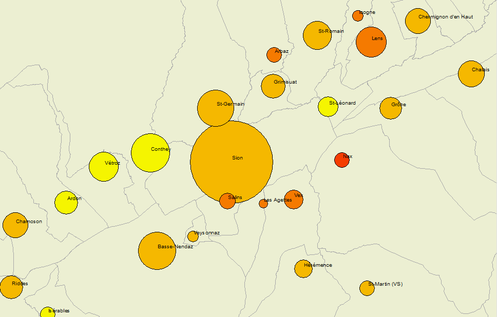
Bivariate thematic mapping with ArcMap? Yes you can!

Colored proportional circles cannot be drawn directly on polygons, but they can be drawn on points. Thus, all you have to do first is to put your polygon data into point data. In the following example, I will be using a pre-existent point layer of commune centers to map data pertaining to the communes. This is a standard cartographic practice when mapping with symbols, as the populations you map tend to concentrate, well… in those centers. If you were mapping, say, climatic data, you would put your circles on the spots of the measurement stations. If you don’t have such a point layer, you can make one, for example by using Data Management Tools > Features > Feature To Point. In this example I already have my commune centers:

Points and polygons

Points and polygons

The next thing to do is to add thematic data from polygons to points. You can do this by the “join” method, based on the spatial locations. Every point falls inside a polygon, and gets its data. The new point layer will be saved wherever you want, under whatever name.

Joining data from polygons to points

Joining data from polygons to points

Usually, you have raw data only, given in absolute values. Colored circles are useful above all when you want to show both proportional and absolute values. Proportional values should be rendered as color shades, and absolute values as symbol sizes. In this example, we will show the population of women per commune, and their relative importance, given in per cents of the total population. We have to calculate these per cents. This can be done by first opening the attribute table of our freshly produced point layer and by adding a field:

Add a new field to the attribute table

Add a new field to the attribute table

We shall name our new variable “pct_femmes”:

Creating a new variable

Then we use the field calculator to get the percent of total population. Note that I use the Python language in my script. VB works too, but looks slightly different :

Percent of total population

Now everything is ready to produce proportional circles. Right-click on your point layer to open its Properties. Under the Symbology tab, choose Quantities > Graduated colors. Pick your relative variable (“pct_femmes” in our case) and your color ramp. Than click on the “Advanced” button and pick “Size…”. In some cases, you might need to “Apply” first, otherwise “Size…” remains greyed out.

As my size variabe, I pick “P00BWtot”, which, in my case, is the absolute number of women. I divide it by 100 to limit the size of my circles. Log() or another transformation can also be applied, in order to smoothen the variation of circle sizes.

Picking a variable for circle size

Picking a variable for circle size

This is it, your bivariate symbol map in ArcMap, you’re done…

Bivariate symbol map in ArcMap

Bivariate symbol map in ArcMap

… or almost done. Apparently, symbol “size”, in ArcMap, defines not the surface of the circles, but their diameters. There is a π * r^2 factor you have to account for in your formula. π being a constant, you can skip it if you wish, but you need to square-root your values if you wish your circle areas to be proportional to them. Thus, “Sqr ( [Sum_P00BWTOT]/ 3.14)” or simply “Sqr ( [Sum_P00BWTOT])” is what you want to use as for your Advanced Size expression.

Further, as you can see on the figure above, ArcMap does not take into account circle overlapping. If you don’t want your large circles to hide the small ones, you have to order them by size, in descending order of your population variable (in our case Sum_P00BWTOT). In ArcMap, sorting your table in table view won’t be enough for this purpose. You need to sort your dataset in the dbf file, which is only slightly more tedious. Use ArcToolbox > General > Sort to do this:

Sorting data in ArcMap

Sorting data in ArcMap

An alternative method would be to order the dbf file associated with your layer with some external software, for example Libre Office Calc. But I will not get into the details of this here. Using the methods described up to here, this is what you get. This time you’re all set:

Bivariate symbol map with sorted overlapping circles in ArcMap

Bivariate symbol map with sorted overlapping circles in ArcMap


Category: Tools  | Tags: ,  | Leave a Comment
Sunday, April 01st, 2012 | Author:

When you export maps from ESRI ArcMap to Adobe Illustrator, the raster background is by default exported as a series of associated bitmap strips, with superposed vector polygons.Here an example:

Bitmap strips (detoured in orange) and vector polygon layer (in blue)

Bitmap strips (detoured in orange) and vector polygon layer (in blue)

In this – as in many other situations – you might need to crop the image to a specific area. Say the following rectangle:

Area to crop

Area to crop

To do so, first dissociate the vector layer from the raster strips. Then select the raster strips. By default an image options menu will appear just below the menu bar. On this, prese the button “modify the clipping mask” (modifier le masque d’écretage in my French version of Illustrator)

Modifify the clipping mask (modifier le masque d'écretage)

Modify the clipping mask (modifier le masque d'écretage)

Moving lateral line of the rectangle, then, will not make the image smaller but will crop it horizontally:

Dissociate all strips before cropping vertically. Otherwise, Illustrator crops all grouped elements individually, which would turn your bacground into a zebra. Dissociate like this:

Dissociating horizontal stripes

Dissociating horizontal stripes

Once the stripes dissociated, you can crop only the uppermost strip that you want to keep, like this:

Cropping the uppermost strip

Erase all the strips above (you don’t need them anymore).

Once you’ve done this, you’re done with the raster aspect. The vector part, though hasn’t been cropped yet as shows the following image:

Cropped raster, uncropped vector layer

Cropped raster, uncropped vector layer

To crop the vector layer, create a rectangle of the size of your vector area and select both the rectangle and your vector layer. Once you’ve done this, open the “pathfinder” toolbox and click on the “division” button, like this:

Selected cropping rectangle and all of the vector polygon layer

Selected cropping rectangle and all of the vector polygon layer

That’s it. You’re done:

Cropped raster and vector map in Illustrator

Cropped raster and vector map in Illustrator